
Yoga Connect
Using directed storytelling to understand user wants.
TL;DR
(too long; didn't read)Directed storytelling paved the way for an app that connects users to yoga instructors. Wireframes of varying fidelity were created to illustrate the idea. Lastly a low fidelity interactive prototype was put through usability testing with potential users. These users were less than impressed with the design so a few changes were suggested.
Overview
My Role: UX Researcher and Designer
Methods: Directed Storytelling, Information Architecture Diagramming, Mid-Fidelity Wire-framing, Interactive Prototyping, Usability Testing
Tools: Sketch, Axure, Google Suite, Zoom
Deliverables: Directed Storytelling Report, Low Fidelity Sketches, Mid-Fidelity Wireframes, IA Diagram, Interactive Prototype, Usability Testing Report
Research
The idea for Yoga Connect came from directed storytelling interviews conducted with individuals who used yoga as the primary way in which they improved their wellness. The interviews illustrated that yoga experiences and practices are extremely diverse and there is no one-size-fits-all yoga class. For many people who practice yoga, it took a period of trial and error to figure out what types of yoga classes would work for them.
The Goal
The goal of Yoga Connect is to match individuals with yoga practices that will meet their specific wellness needs and goals, thus allowing them to begin their wellness journey without a prolonged period of trial and error when finding a yoga practice.
IA Diagramming
An informational architecture diagram was created to illustrate the number of pages needed to make the app functional for first time users. This diagram determined what pages needed to be built out first in order to get user feedback right away. Having an AI diagram available made it clear where affordances needed to be placed on certain pages and made the initial sketching phase much easier.
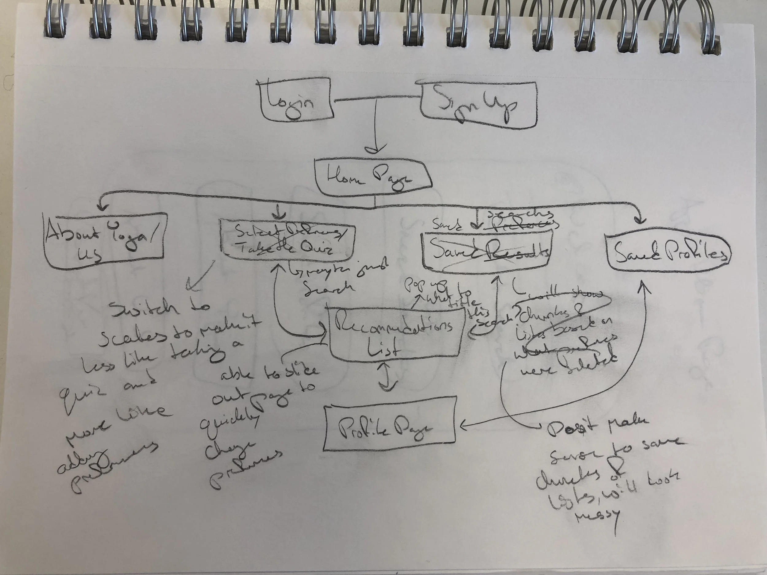
Initial Low Fidelity Sketch
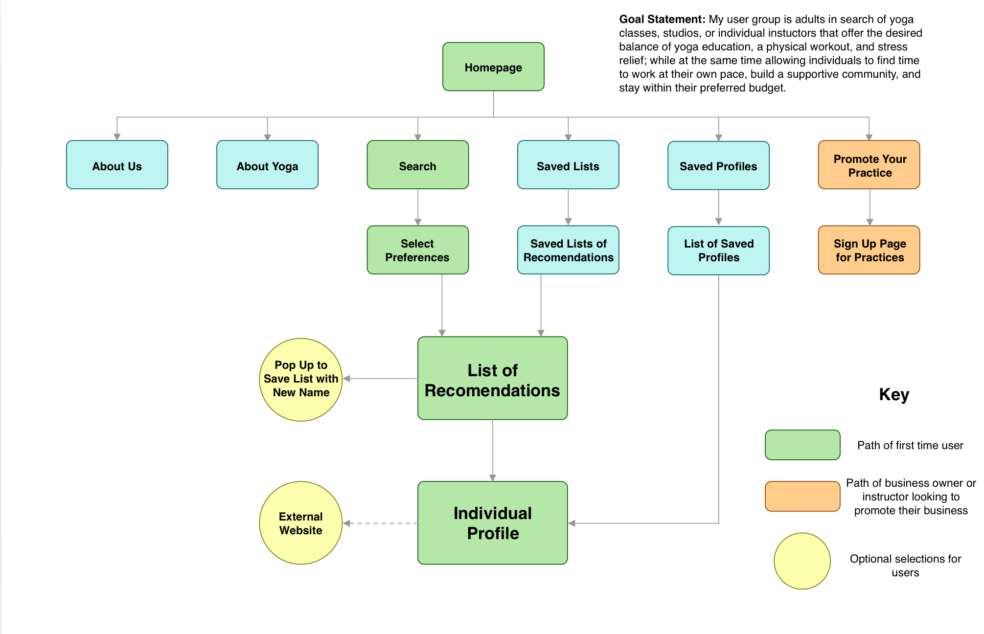
Final User Flow Diagram
Wireframes and Interactive Prototypes
Planning for the app began with drawing low fidelity sketches. These simple hand drawings depicted general placement of logos, buttons, and pictures.

Results Page Sketch

Profile Page Sketch

Save List Pop Out Sketch
Mid-fidelity wireframes were developed to show the general design for the app and to illustrate how users would get from one page to the next.
Low fidelity interactive prototypes were then developed. In creating these prototypes, the information architecture diagram expanded vastly. The prototypes were kept in a low fidelity state during usability testing to focus on improving functionality and making every aspect of the app accessible.

Low Fidelity Homepage

Low Fidelity Questionnaire Page

Low Fidelity Results Page

Low Fidelity Results Page
Usability Testing & Results
Testing
Usability testing was conducted in person with three participants. The goal of running these tests was to determine initial impressions of the homepage and see if users could complete tasks with ease. The specific tasks tested focused on main user groups (yoga students and yoga instructors). The first task asked participants to conduct a search for a new yoga practice. The second task had participants submit an instructor/studio profile.
Results
The usability testing proved that the app was functional and usable when participants were given a specific task to complete. The largest issue was the initial homepage design. It did not give users enough information about what the app was designed to do.
Next Steps
The next phase of this project would mean taking the insights gathered from the usability testing and apply them to the prototypes. The homepage should be redesigned to give more context to the platform and minor changes could also be made to the search questionnaire.
Conclusion
Directed storytelling methods were key to the initial designs of this app. Without talking directly to the user this app may not have been beneficial to them. Talking to users is truly the first step in understanding the problem. Once the problem is clear, designers can then start working towards a solution.
This project started completely from scratch! If you have an app idea and would like someone to make some sketches for you, feel free to contact me!